
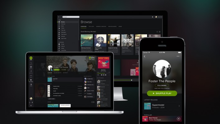
Spotify has launched its biggest overhaul since it was first released back in 2008. Whether you use the service on the web, desktop or iOS, straight away you will notice that its new look is flat and dark, with a colour scheme that is black, black and more black.
Of course it is not completely without colour, as there are some green highlights and the new rounded icons are a light grey. The overall effect makes the content almost appear to jump out from the background.

Despite the harshness of the all-black colour theme, there are some added touches and features which have a softening effect. For example, the redesign sees softer edges, a heavy use of blurring on background images and the new Proxima Nova typeface is clean and very rounded.
Another change you will notice is the addition of a round profile image for both artist and user pages, while the content is displayed as ‘cards’ during browsing. Overall there are far more images incorporated into the interface when compared with the old version.
As well as aesthetic changes, Spotify has also added a new search feature that not only functions across all platforms but is also very fast. For the first time users of the service will be able to get the most out of the collections feature, which is designed to allow you to add albums to the library, rather than having to save them as playlists.
The final finish of the new-look Spotify is a stark, yet sharp looking service that should make the whole experience quicker and easier to stream and enjoy your music.
[Image via Spotify]
SOURCE: http://www.engadget.com/2014/04/02/spotifys-new-design