
Understanding The Difference Between RGB And CMYK In Photoshop
How ToPhoto and Image September 26, 2014 Scott Lee
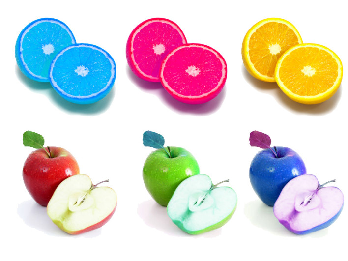
Apples and oranges, both fruit, both spherical, both have pips, both can be peeled, it’s astonishing that we can tell them apart, and yet everyone manages it. Some people have described RGB and CMYK as the apples and oranges of colour image formats, but they’re not, they are two different ways of displaying colour, you can’t eat them and neither of them have pips. Most people misunderstand the difference between RGB and CMYK, but it is possibly the most essential part of creating any digital colour image, so worth trying to get to grips with.

Understanding The Difference Between RGB And CMYK
Back to basics then, RGB stands for red green blue, CMYK stands for cyan,†magenta,†yellow, and†black. Actually the K stands for key, but black is the always the key colour in CMYK printing, so think of it as black, it helps.
With RGB, all the colours are made adding different mixes of R, G and B, red, green and blue. With CMYK all the colours are made by taking away different mixes of cyan,†magenta and†yellow, although for really dark tones, and to save on ink, you also have black. So if you ever run out of black ink and really need to print that important document, just try using a very dark blue.
So whatís the difference? Well, on your computer monitor, the colours are also made up by adding red, green and blue together, so if you are creating images for display on a monitor, use RGB. On printed material, photos, paper, fabrics we tend to use CMYK printers, so if you are creating images for print, use CMYK.
As one is subtractive and the other additive, they produce a different range of colours, and they are also displayed differently, one uses light, the other uses light absorption, as well as printing techniques like halftoning to produce the colours.
But, I hear you cry, I always use RGB for my photos, and they look fine, what’s your problem? Try comparing the image you see on the screen with a printed photo of the same image, look at the larger areas of colour, like sky, skin tones or any flat surfaces, particularly colours you are familiar with in real life. Like the orange of an orange or the red and green of an apple. Some feel natural organic colours ten to look better in CMYK, others don’t notice, but the conversion process is far from perfect, hence the importance of starting as you meant to go on.
You can choose between RGB and CMYK colour modes in Adobe Photoshop by using the Image, Mode menu. So before you start creating any image, ask yourself “apples or oranges?”
[Image via: Russ Payne]