
How To Make Text Float In Photoshop
How ToPhoto and ImagePhoto and Image Editing October 12, 2014 Scott Lee
With the possible exception Peter Pan, everyone and everything has a shadow, as long as light is hitting it. Internal shadows appear where the surface contours towards and away from the light source. External shadows appear behind wherever the light source is. Multiple light sources cause multiple shadows and without consciously thinking about it, we pick up a lot of information from shadows like depth, texture, solidity and position.
A simple trick to make an image or text appear to float above the layer behind it, is to repeat an opaque mask of the same image at an offset position, the mind presumes it is an actual shadow and it gives the impression that the image or text is floating. The larger the offset, the great the distance from layer to layer.

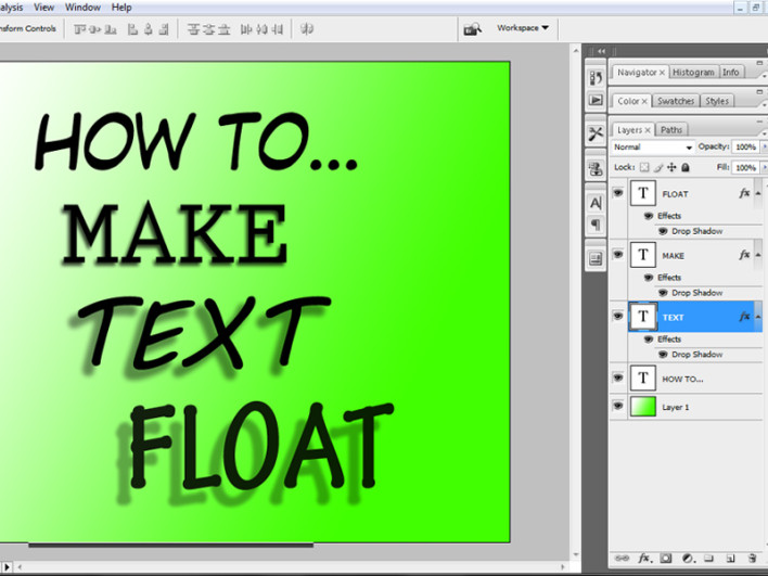
Photoshop does most of the hard work for you by offering an automated Drop Shadow option in the Blending menu. It’s primarily used to give text a feeling of depth, but it does has other exciting uses. Try it out by creating a text layer, then right clicking and choosing Blending Options. Then click on Drop Shadow to bring up the variables menu for that blend.
Blend Mode for Drop Shadows works in the same way it does for any layer, it defaults to Multiply which suits shadows so well since it takes the existing layer and shades it, but you can choose Normal for a starker shadow if you are working with more flat colours.
Changing Opacity (how transparent the shadow is), Angle (the direction of the shadow, remember not to have different shadows pointing different ways), Distance (how far away the shadow is from the object, so how far from the layer the illusion of height appears), Spread (the percentage of fade at the edge of the shadow) and Size (unsurprisingly, the size of the shadow).
At the very bottom the Layer Knock Out Drop Shadow tick box can be useful if your text layer is transparent, it allows the layer to cover the shadow, leave it alone unless your text is unfilled or transparent, but worth using if your text is transparent or partially filled. Try ticking it and unticking it to see if you get a satisfactory result.
So with just a few clicks you can really make a layer stand out and give that 3D hovering look to any image or text, all by creating the illusion of a shadow.
[Image via Russ Payne]