
How to Customise Text in Photoshop
How ToPhoto and ImagePhoto and Image Editing September 20, 2014 Scott Lee
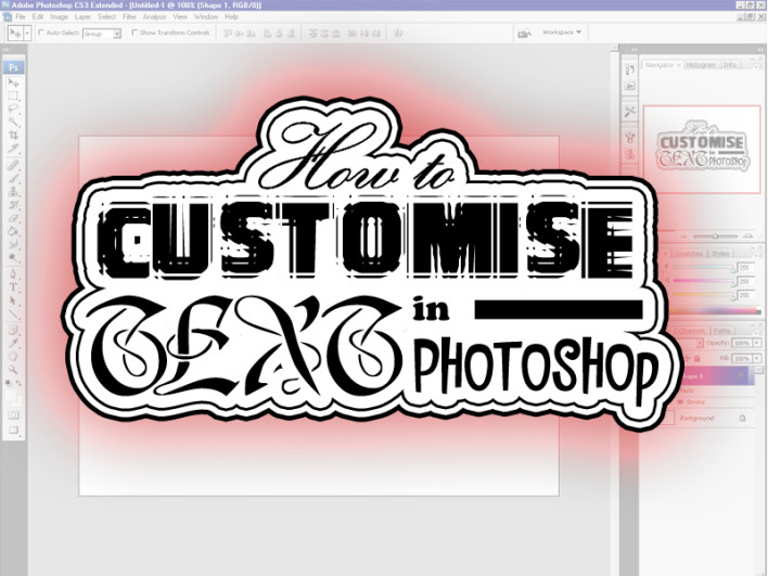
Have you ever needed a quick Logo or Title but just didnít have the time to draw it yourself or search for a suitable new font? Those dull old fonts you already have can be spiced up using a few of Adobe Photoshop‘s simple blending tools, and this gives you the added advantage of being able to apply the same range of effects to new text as you type it, for a uniform house look and feel.
Open a new PSD document and select the text tool to create a text layer. Now type in your text and notice how it creates a layer on the right. Right click on this layer and choose Blending Options to bring up the Layer Style menu that contains ten of the most common style actions you would want to apply to text. Click on each in turn to adjust the values for that style.

General Blending at the top gives you a simple Opacity value for fading the layer and some more Advanced Blending values for mask and gradients. This really is more for merging and blending images than for text, for logos and titles leave this one alone for now.
Drop Shadow is much more useful, it creates a nice shadow dropped behind your text layer to make it stand out as if it were floating a little above the layer below. You can play around with the opacity, angle, distance, spread and size of your shadow here, experiment to see how each looks.
Inner Shadow works less well with text, it’s attributes are much the same as Drop Shadow, but this time the darker shadow layer falls within the image layer. Can be handy for adding depth to a larger font, but the next option works better for that.
Bevel and Emboss allows you to create false edges on the interior of fonts, so each letter appears have raised levels. Change the bevel style once the depth is at a noticeable percentage to try each type, once that looks suitable, change the shading angle and altitude to enhance it.
Ignore Satin, it’s more for photos, but the next two Color (sic) Overlay and Gradient Overlay allow you to fill the text shape with a flat or gradiated colour. Handy for blocky texts, allowing you to completely change how they look by filling in holes, adding edges or merging in strokes. Use this attribute last after you have added the others. Pattern overlay never really works with text, although combined with an opacity level it can do interesting things, experiment and see.
Last is stroke, this adds a border around and inside the edges of any text. Smaller gaps can be merged out by increasing the stroke value. One great tip is to add a stroke in white, then convert the layer to a smart object, rastersize it, then add another stroke in black, and repeat as many times as you like to give a carefully stencilled outline to any text block.
Don’t use all of the above at once, generally just one or two is more than adequate to spice up the text into something resembling a logo. Using the Blend Options menu you can quickly see each effect looks like in turn and pick the ones you feel are most pleasing to the eye.
As long as you have not yet converted the layer to a smart object or rastersized it, you can then also duplicate the layer, overtype new text and all the same values will be applied to this layer immediately, so saving styles you like for future projects gives you instant customised text the next time you need it too.
[Image via Russ Payne]